SUMMARY
- Some examples of Design System
- Atomic design as a foundation
- The Design System: what impact on the UX and UI?
- What is a Design System technically made of?
- The governance of the Design System
- Conclusion
Most of the projects we work on today involve a large number of participants, a multitude of teams with specific and distinct skills and perimeters, all of whom collaborate in the various design and development phases of the products we build. These projects are carried out in parallel, sometimes by teams isolated from each other, in silos.
As the number of stakeholders, teams, and projects increases, it becomes more and more complex to guarantee the coherence, consistency, and quality of the products that are developed. Sooner or later, the user experience (UX) will not be the same from one product to another, nor will the interface (UI) that will be presented to the user be the same. In this situation, we will often see important differences in the visible rendering and interactions of the applications that are delivered. We will particularly see differences in the interface, visible by the user, which should however in the majority of the cases be homogeneous:
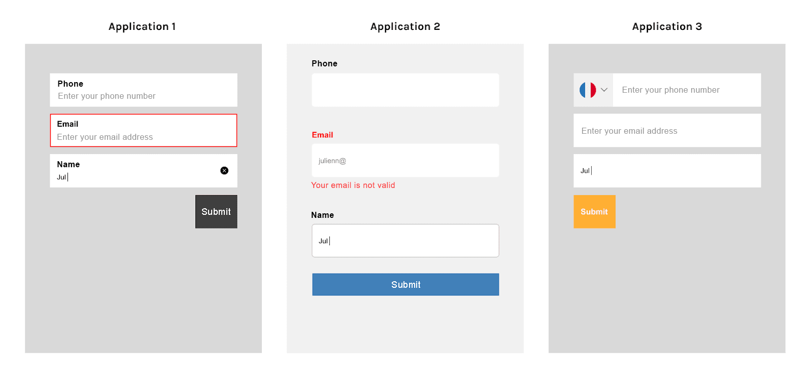
The general quality of the products will not be homogeneous either, because it will be within each of these projects that choices will have to be made, which should however be made in a global, transverse manner. These are the same choices that will guarantee the desired level of quality for all projects: Opquast rules, accessibility, security, RGPD compliance, performance, etc.
The implementation of a Design System allows to solve these problems and brings other advantages:
- Guarantee the respect of the brand image on all digital products
- Guarantee the homogeneity of the graphic interface elements, and the way of communicating (tone, …)
- Centralize the elements, allowing their reuse by the various stakeholders
- Reduce design and development time, by providing reusable elements, thus reducing budgets and lead times.
Attention, a Design System is much more than a simple graphic charter or a library of components. It is a common language between different teams and projects, which allows the implementation of unified interfaces on the web, mobile applications, big clients, …
As soon as multiple projects are carried out and multiple teams are involved, the question of implementing a Design System must be asked: it can be a real advantage to optimize internal work, but also to help service providers to apply more quickly the principles they must respect in the projects they deliver.
SOME EXAMPLES OF DESIGN SYSTEMS
There is no ready-made formula, no recipe, to build a Design System.
Here are a few examples that show the diversity of choices made by different teams of administrations, software editors and other private companies:
- The Design System of the French State (French)
- The Health Insurance Design System (French)
- The Design System of the Government of the United Kingdom (GOV.UK) (English)
- Polaris, the Design System of Shopify (English)
- Atlassian’s Design System (English)
- Carbon, the IBM Design System (English)
- Lightning, the Design System of Salesforce (English)
- Vitamin, the Design System of Decathlon (English)
- The Design System of Audi (English)
ATOMIC DESIGN AS A FOUNDATION
The principle of “atomic design” was exposed by Brad Frost in 2013: rather than creating independent pages/screens, each composed of elements designed and developed in isolation, we should instead create components, reusable across all the page templates we create.
Thus, a button displayed on several page templates is effectively identical, both in terms of design and code: we will design and code this element only once, and reuse it. This does not prevent it from being able to adopt several presentations and behaviors, but within the limits of those provided.
The general principle is the following:
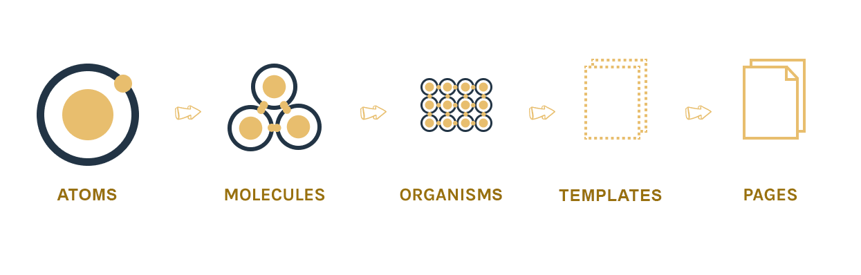
The elements composing this model can be described as follows:
- Atoms: these are the smallest elements composing the interface, like the label of a form field, a text field, a button.
- Molecules: they are composed of atoms. For example, a molecule is the combination of the 3 atoms mentioned above: the site’s search component, consisting of a label + a field + a button.
- Organisms: they are composed of molecules and atoms. For example, an organism would be the header of the site, in which the “Search” molecule defined above would be found.
- Templates : they are composed of organisms, molecules and atoms. A template would be, for example, the home page of the site, in which the “Header” organism is found.
- Pages: these are all the instances of the templates that users can consult on the site.
A Design System will be mainly intended to host reusable elements at the level of atoms, molecules and organisms. Some templates can be proposed for certain classic screens/pages, but the particularities of each site/application require, most of the time, specific templates.
THE DESIGN SYSTEM: WHAT IMPACT ON UX AND UI?
UPSTREAM, USER RESEARCH
The principles remain the same in the creation of a Design System: the user research phase, and the understanding of needs and expectations is always essential.
It is the result of this research phase that will guide the design phase that follows and that will allow us to identify the components that must be produced.
The UX will therefore have a definite impact on the Design System, but the fact of setting up a Design System will not have any particular impact on the way in which a UX research phase is conducted; the Design System will, however, have an impact on the design of the interface elements and therefore on the UX design phase, given the need to think about and create elements that are flexible and reusable.
INTERFACE DESIGN
The design of interfaces will have to be adapted in a significant way:
- It is necessary to use an adapted tool, like Sketch, Figma, … allowing to create symbols/components which become essential
- We have to think about the interface elements in a more flexible way so that they can be reused: we can no longer think about each element individually. We have to make sure that the designed components can be reused on different pages, in different tools, and that they adapt properly
- We have to modify and evolve the components (a bit like when we refactor code): a new need for a new tool will impose modifications on an existing component, created during a previous project, …
- Decisions have to be made about what should or should not be part of the Design System: regularly, new requirements require decisions to be made about how to deal with them (new component, a “snowflake” outside the Design System, an update of an existing component, etc.)
When creating a Design System, the interface design phase will often be more complex and longer than a classic design phase without a Design System, but it will save precious time: subsequent projects are based on elements that have already been designated, tested and developed, which can be reused as they are, or possibly adjusted to meet new needs.
WHAT IS A DESIGN SYSTEM TECHNICALLY MADE OF?
DESIGN TOKENS, THE SMALLEST ELEMENTS OF THE DESIGN SYSTEM
We can extend Brad Frost’s metaphor by talking about “Nucleons”, the sub-elements that make up atoms. In these elements, we will find the basic definitions of colors, font sizes, spaces and margins, …
These elements are called “Design Tokens”.
These Design Tokens can be defined and maintained in the design tool (Figma, …) or in the technical part of the Design System. The choice will have to be made on a case-by-case basis for Design System projects, depending on whether one wishes the design tool or the technical part to be the source of truth.
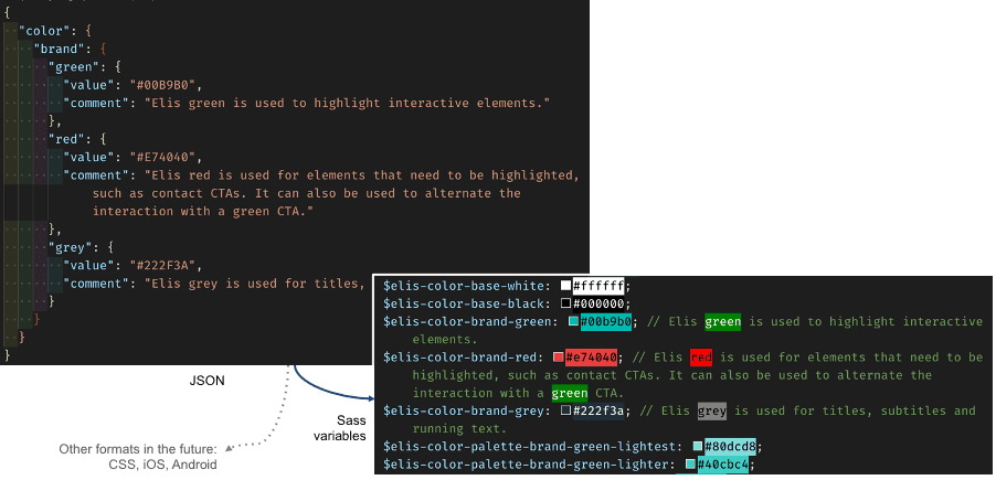
A format for defining this key information is being standardized on the basis of JSON, which will facilitate the implementation of synchronization mechanisms between design and technical tools, and the portability of Design Tokens definitions in different market tools and development platforms.
A Design System is not immutable. It must facilitate updates of the various elements that make it up to adapt to new needs, or integrate patches when necessary. By centralizing the basic definitions and making them independent of the technologies used, Design Tokens greatly facilitate these updates.
This concept was created by Jina Anne, then at Salesforce:
“Design Tokens are visual atoms of the Design System – specifically they are named entities that contain visual design attributes. We use them instead of ‘hard-coded’ values to keep the Design System scalable and consistent.”
But they don’t just define which colors/fonts/sizes/… are allowed, they define in which contexts these elements should be used.
Design Tokens ensure the coherence of the whole Design System, and must be organized in a logical way to be updated when necessary.
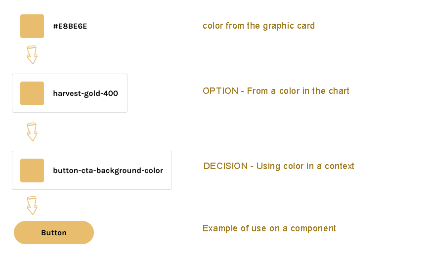
There are 3 types of Design Tokens:
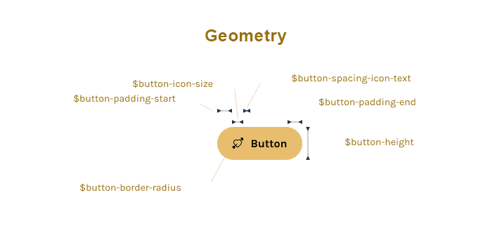
- Option Tokens (also called “Global Tokens” or “Base Variables”): these Tokens define the basic values of colors, dimensions, fonts, … out of any context of use.
They can change if the graphic charter evolves.
Example in the form of Sass variables:

$color-neutral-20 = #222222;

$color-neutral-90 = #EEEEEE;

$font-size-m = 1rem;

$font-size-s = 0.875rem;

$space-m = 16px;

$space-l = 32px;
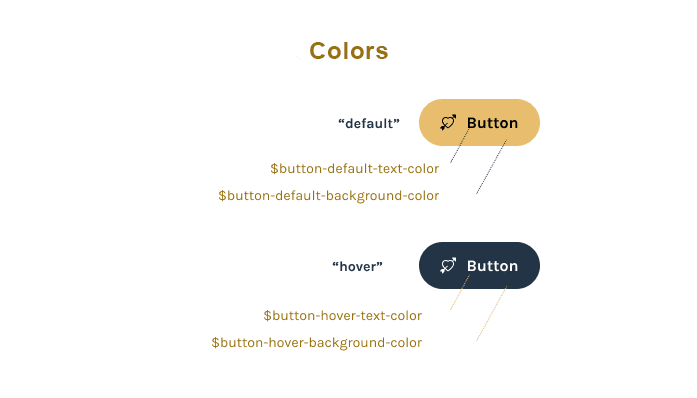
Decision Tokens (also called “Alias Tokens” or “Semantic Tokens”): they link the Option Tokens to a purpose, a usage, a context. These elements can change, they do not have to have a “hard-coded” value.
Example in the form of Sass variables:

$background-color-dark = $color-neutral-20 ;

$background-color-light = $color-neutral-90 ;

$font-size-paragraph = $font-size-m ;

$font-size-microcopy = $font-size-s ;
Component Tokens: they are specific to a component. They use Option Tokens and/or Decision Tokens. They are especially useful if UX/UI identical components have to be developed in different technologies/frameworks. If this is not the case, many Design Systems do not have this type of tokens, and the components integrate these properties directly.
Here is an example of the relationship between these three “floors” of Design Tokens:
For more information:
- Design Tokens beyond colors, typography, and spacing
- Naming Tokens in Design Systems
- Design Tokens dans Lightning Design System
- Design Tokens W3C Community Group
- Design Tokens Glossary
The definition of these Design Tokens, beyond the transcription of the graphic charter, will also guarantee a good level of accessibility at the level of the colors and their contrasts.
See the example below:
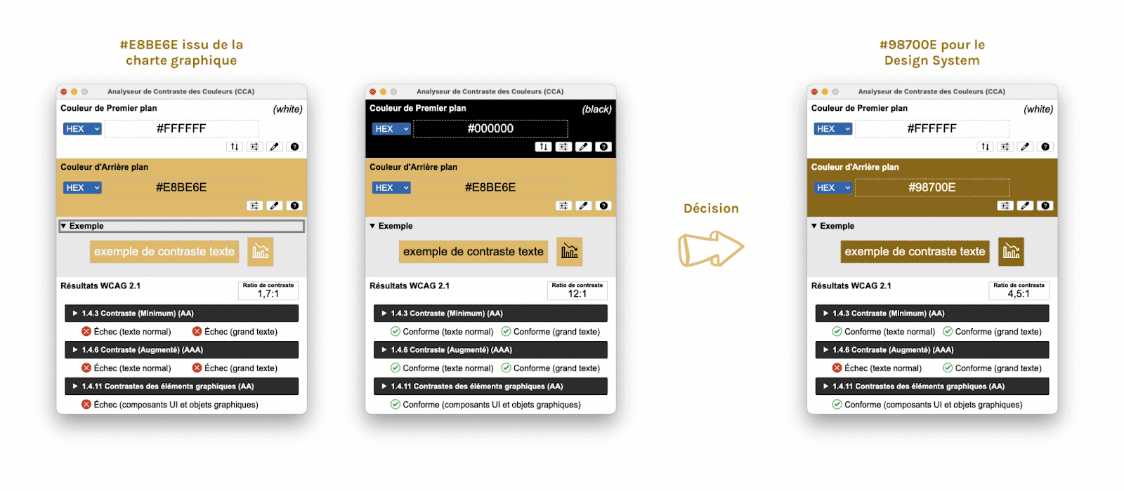
The contrast between the white and the gold of the graphic charter was not sufficient (left diagram)
The contrast of the dark gray of the chart with the same gold was sufficiently contrasted but not visually satisfactory (middle diagram)
A darker gold color was identified for the Design System, and integrated into the Design Tokens, guaranteeing the use of sufficient contrast on all components using these colors (right diagram)
Dedicated tools are used to generate these Design Tokens, to make them usable in project development, by generating different specific target file formats.
One of the most popular tools today is “Style Dictionary“, a free and open source project created by a team at Amazon.
It is notably used by Adobe for its “Design Systems Package” format integrated to the XD design tool. It is also part of the references inspiring the standardization by the W3C community group already mentioned.
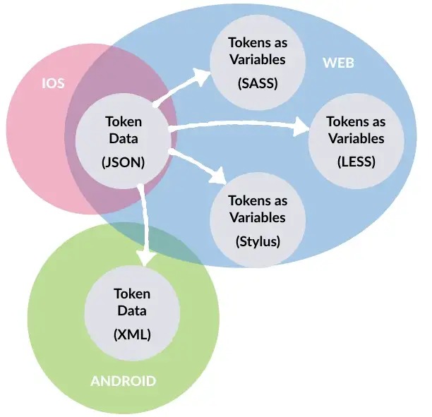
By default, tokens are specified in JSON format (JSON5, YAML, TOML, … can also be used), and resources can be automatically generated for many target platforms: Custom Properties CSS, Less or Sass variables, TypeScript, JavaScript, iOS, Android, …
Here is an example of switching from JSON format to Sass variables format:
THE COMPONENT LIBRARY
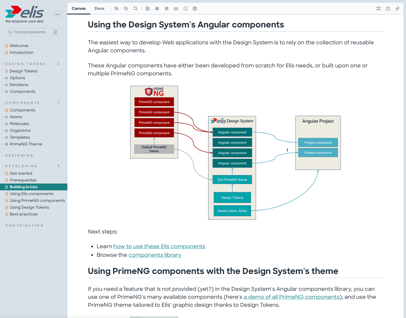
The principles of components have been discussed earlier in this article. Everything is based on the Atomic Design model formalized by Brad Frost.
Many tools are available to manage and catalog the components of a Design System.
With more than 10 million installations per month and more than 1500 contributors, one of the most popular today is Storybook, a free and open source project developed by Chroma Software.
Storybook is very popular, and used by Airbnb, Salesforce, IBM, Atlassian, Lyft, GitHub, …
Even if it allows it in part thanks to the support of the MDX format (an extension of Markdown with React components) for documentation, the objective of Storybook is not to port a complete Design System, but rather the component library.
The goal is to facilitate the development of components in isolation, outside of any application, to present them in an interactive way to facilitate their adoption and to facilitate their testing.
Although developed in React, Storybook can host a library of components developed in React of course, but also in HTML and Vanilla JS, Angular, Svelte, Vue.js, Twig, Nunjucks, …
“Storybook is a powerful environment for teams to design, develop, and organize interface components (even entire screens!) without getting caught up in the logic and interfacing with business data.”
Brad Frost
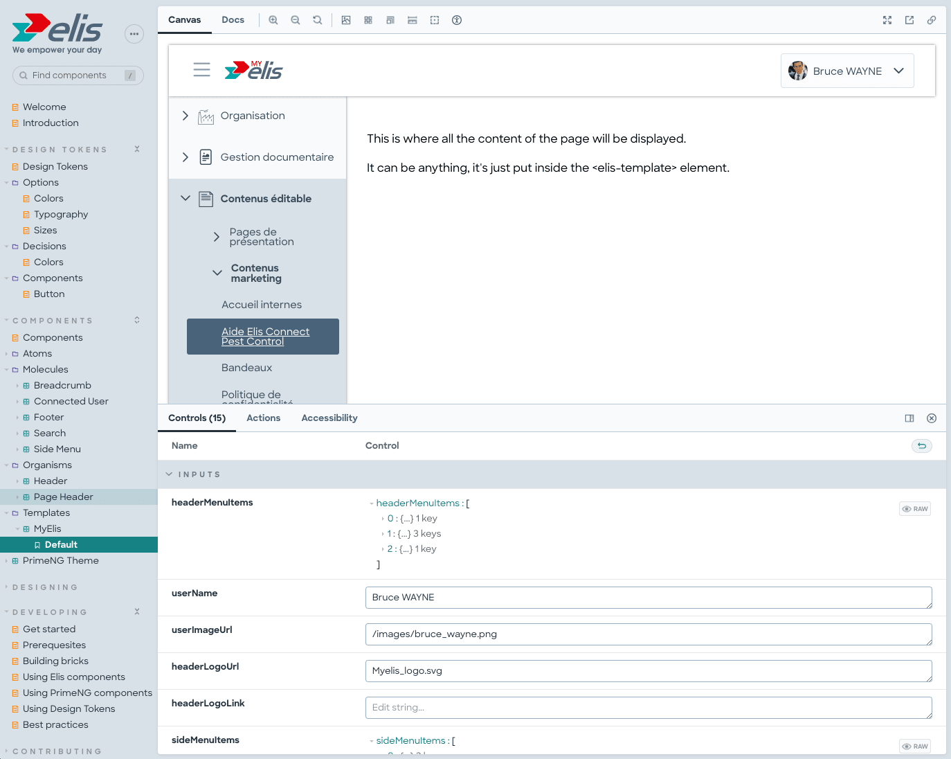
Here are some screenshots of a Design System developed and documented with Storybook, including Design Tokens managed with Style Dictionary and Angular components:
Some examples of component libraries using Storybook:
For more information:
GOVERNANCE OF THE DESIGN SYSTEM
SUCCESS CRITERIA
The success or failure of the Design System does not only depend on its technical quality, it must evolve according to the needs. Among the points you will have to pay attention to, we can mention:
- Updating processes must be established so that its content is complete and always up-to-date
- It must be easy to access (simple URL to remember, accessible from the outside for subcontractors)
- It must be well organized: main principles, best practices, style guide, design tokens, component library, …
- It must be flexible enough to allow for evolutions and adaptations, and even exceptions
- It must be shared with the teams, who must take ownership of it
- It must be open to contributions, via a simple process
- Time must be made available to certain team members who must be responsible for maintenance, communication, and generally keeping the Design System alive
In other words, the Design System will allow you to save money on the design and development of your projects, but in exchange it will require a substantial investment in order to remain relevant and useful.
It is therefore not a product to be implemented systematically: the application ecosystem must be large enough to benefit from it, and you must be ready to make the necessary investments so that it can continue to be used effectively over time.
Just like an accessibility, performance or quality project in the broadest sense, this is not a “one-shot” project. It is a product/service that must be maintained over time so that it continues to be effective and relevant, and thus encourage its adoption.
TEAMS AND ROLES
Depending on the context (size of the project, size of the organization, …) the team to be put in place to create the Design System can vary. Here is the type of profile that we generally find:
Developers and designers (UX and UI)
Developers and designers (UX and UI) are at the heart of the creation of the Design System, they are the ones who will design and code the components, define the Design Tokens on which the Design System will be based, … They will bring this tool to life by making it evolve according to the needs of corrections or evolutions that are necessary.
Business
The business, or the team responsible for the product, will define and prioritize the needs, which are essential to know the context of use of the components that will be designed and to anticipate the use that the end users will have.
Marketing and communication
As the Design System integrates reference information related to the tone to be used and the graphic charter, the communication and marketing professions are necessarily involved in the development, validation and evolution of this tool.
DesignOps
We can also find “DesignOps” profiles that will be in charge of, among other things, the implementation of design, communication and industrialization tools that will be necessary for the implementation of the Design System, as well as the evangelization that must be carried out to ensure the adoption of the tools.
Other profiles, depending on the context
We will also find accessibility experts to ensure the compliance of components with standards such as the RGAA, quality assurance managers to test the reliability of components, UX researchers to conduct studies and surveys to understand the behavior, expectations and needs of users, … The profiles can be numerous!
Organization
Knowing which profiles to include in the creation and maintenance phase of the Design System is a first step, but you also have to make the right choices in terms of structure.
To summarize: beware of organizations that are too far removed from the realities of the projects to be carried out: a single person who creates a Design System within the framework of his project will have difficulty proposing elements that can be reused by other projects where the needs are different. This person alone will also have difficulties in making the system evolve, which will frequently lead to the non-adoption of the Design System by other teams.
When the number and scope of projects and the size of the teams require it, a more collaborative model should be favored, where the different project teams can co-construct a system, where discussions are more frequent, and where the Design System can evolve more according to the needs of each team. Be careful, however, to plan for a core group that can lead the collaboration and ensure that it runs smoothly.
In some organizations where projects are mainly subcontracted, both in terms of UX and development, it will be necessary to anticipate the need to have service providers / agencies contribute to the Design System, after having imposed its use on them.
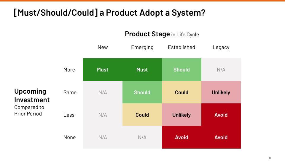
WITH WHICH PROJECTS TO CREATE A DESIGN SYSTEM?
Should we create a Design System only when we launch a new redesign? Or can it be considered for an existing project?
It all depends on what the future holds for your product: if it exists, and investments are planned in the future to make it evolve, then you should probably integrate it into a Design System.
Ideally, the initialization phase of the Design System should be integrated with the redesign of a pilot project, which will allow you to create a first version of the components that can later evolve when other projects, products, or platforms are integrated into the Design System.
A small diagram to help you make a decision:
Conclusion
The advantages of Design Systems for organizations are undeniable, and it is important to understand that implementation can be done very gradually while building on an existing project or projects.
The progressive approach, starting for example with the definition of the main principles and a few Design Tokens, allows us to enter into a continuous improvement process which can only be beneficial. It allows us to progressively refine the concepts and tools, and the way to interact with the project teams.