SUMMARY
- Static site generators (in React)
- Atomic Design: Layout / Zone / Component approach
- What does React bring us as a templating engine?
- Reusability of components for build and apps
- Conclusion
Static site generator
In recent years, the Jamstack has been on a roll, with many advantages (mainly web performance) and an attractive approach for many use cases, from the simplest to the most complex. Most JavaScript libraries and frameworks now offer Server Side Rendering (SSR), such as React, Vue.js or Angular. This possibility has opened the door to static site generators, which are based on these libraries as rendering engine. We will mainly present here all the possibilities of React as a templating engine, as we can find it in Gatsby, Next or React Static, because the project and team context imposes it.
Moreover if you want specific solutions, you can thanks to the methods dedicated to SSR (notably React.renderToStaticMarkup()), create your own, adjusted to your needs.
Now that we are going to use React as a template engine, a library based on a component approach, we should move towards an Atomic Design approach for page design.
Atomic Design: Layout / Zone / Component approach
Implementing an Atomic Design approach from the design stage, allows to keep consistency in design and a breakdown allowing flexibility when contributing pages.
For one of our projects, we have made available to the contributors, an exhaustive list of layouts and components, based on the design and needs.
The typical content of a constructed page is therefore a succession of layouts, in this form:
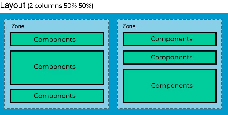


Zones are the only elements directly induced by the chosen layout. An exhaustive list of layouts (Simple, 2 columns, Grid, Accordion, etc.) and components is provided to the contributor, so that he can build his page as he wishes. It is also recommended to have a visual tool to facilitate the creation of the pages – for example a back office application in React communicating with a headless CMS such as Drupal to manage the contents – so that the contributor has immediate visual feedback of his page.
It is therefore essential to consider the fact that each component can be included in any type of layout, and therefore in different contexts (page, zone, etc.). Components should not be interdependent but autonomous, visually and functionally.
What are the benefits of React as a template engine ?
React introduces a concept called Context, allowing to transmit information to its subcomponents without passing them from component to component via props (in React, it is the priorities that are passed to the component during its instantiation).
Thus, we can imagine creating a context:
- Of page: in which we would have all the information related to the current page (slug, title, language or any other metadata)
- Layout: which provides the type of layout, among other things
- Zone (deduced zone size, background color…)
The use of Context is very useful and opens up certain possibilities when integrating HTML.
Conditional classes
In our design, let’s imagine that we can set different background colors for areas as well as other decorators (background image or icon, margins, etc.). The context of the zone can therefore contain these information but also other information deduced from the page context or layout information. For example, one can deduce the type of area (small, large, full width) according to the layout type and its position in the layout: in a 1/3 – 2/3 layout, the area on the right will be large while the area on the left will be qualified as small.
This way, a component has access to its full context in the document (number of columns and layout type (1/2-1/2, 2/3-1/3, …)) and to the area it is in (small/large, margins, background color, …).
Since we have access to this information, we can apply a behavior class (or modify) to the component, relative to one of this information, without relying on a class that the parent has as we would have done normally. We would have written for example:
[css]
.Mycomponent {
flex-direction: row;
}
.Zone.is-small .mycomponent {
flex-direction: column;
...
}
[/css]
Since our component already has the size information of the zone in which it is located, we can apply the class accordingly (so that it is in column and not in line). Therefore, it manages its states, independently of its context.
[css]
.Mycomponent.is-small {
flex-direction: column;
...
}
[/css]
The component will only react to its classes added to the page construction, if it is moved to another column, its behavior will not be dynamic (a component with a class linked to a small area will not change if it is moved to a large area). This way, CSS classes can perfectly follow a BEM-type methodology, where modifying it makes sense, and where each component is truly independent. Combined with CSS variables (Custom Properties), we can make our components completely context agnostic. If we take the example of background colors applied to areas, we can imagine creating different CSS variables according to these contexts (here with Sass variables):
[css]
.Zone {
--zone-background-color: #{$light};
--zone-foreground-color: #{$dark};

// classe à ajouter au DOM avec les informations de contexte
&.has-darkGreyBg {
--zone-background-color: #{$dark};
--zone-foreground-color: #{$light};
}
}

.Mycomponent {
color: var(--zone-foreground-color);
background-color: var(--zone-background-color);
}
[/css]
This way, our components always respect the right colors, depending on those of the area, without having to assign new classes to make the necessary changes.
Conditional rendering:
Since you have the rendering context available at the page build, you can therefore decide not to render certain elements depending on its context.
For example, for a component of type Image + Quote, located in a small column context, you can choose not to generate
the HTML of the image. Whereas in a more classic integration, the source code would contain all the HTML, but the unwanted part would be masked via CSS. Instead of writing:
[css]
.is-small .Citation-img {
display: none; }
[/css]
we can write on the React side:
[javascript]
render (
<div className="Citation"
> { zoneSize === 'large' && ( <img src="" className="Citation-img"/> )} <blockquote className="Citation-text"> ... </blockquote> </div> )
[/javascript]
In our use case, we save this CSS condition, in addition to the useless HTML in the DOM.
Image optimization
In a Jamstack project, it is common to use a CDN / Asset Manager such as a Cloudinary that allows to optimize its assets (images, video). Cloudinary allows to define transformers that can be dynamically applied to the URL calling the image (resizing, cropping, effects, overlay, etc). If you want to know more about Cloudinary, you can consult this mini-conference (slides in English). But these tools need to be used in a smart and combined with good management of src attributes and images on the HTML side.
This is where the use of context can help. Indeed, since at the level of the component that renders the image, we know the size of the column in which it is, we can decide to call an image more adapted to its width.
Example with an IMG component, a contributed component for which the user just passes the reference of an image hosted on Cloudinary, and is in charge of rendering the associated HTML. Our IMG component will thus be able to put in the srcs property and the IMG element transformers adapted to the size of the column in which it is located. Thus an image in a large area will be dimensioned with the size of a large area, while if it is in a small area, its dimensions will be adapted.
[javascript]
const { zoneSize } = useContext(ZoneContext);
const transformer = zoneSize === 'large' ? 'largeImage' : 'smallImage';
...

<picture>
<source
media="(max-width: 1024px)"
srcSet={`
https://res.cloudinary.com/idemo/image/upload/t_${transformer}_1x/sofa_cat.jpg 1x,
https://res.cloudinary.com/idemo/image/upload/t_${transformer}_2x/sofa_cat.jpg 2x`}
/>
<img
srcSet={`
https://res.cloudinary.com/idemo/image/upload/t_${transformer}_1x/sofa_cat.jpg 1x,
https://res.cloudinary.com/idemo/image/upload/t_${transformer}_2x/sofa_cat.jpg 2x`}
src={`https://res.cloudinary.com/idemo/image/upload/${transformer}_1x/sofa_cat.jpg`}
alt="Cat on a sofa"
/>
</picture>
[/javascript]
Reusability of components for build and apps
One of the advantages of using a site generator using React (or any other component-based library), is the ability to reuse all components in your front applications (which is done automatically by tools like Gatsby). We can imagine a search application whose results can take existing components for display (for example the same image component used in the construction of pages). This ensures that the code is uniform and centralized, and that the contributor has before his eyes the real rendering of his work in his back-office application.
Conclusion
There are many other advantages to using a framework like React as a templating engine / static site generator. Combined with a modular design approach, and taking advantage of all its complexity and power, it allows us to improve both our code and the contribution process. Note that this article deals with examples with React, but it is certainly possible to have the same approach with any other component-oriented libraries.